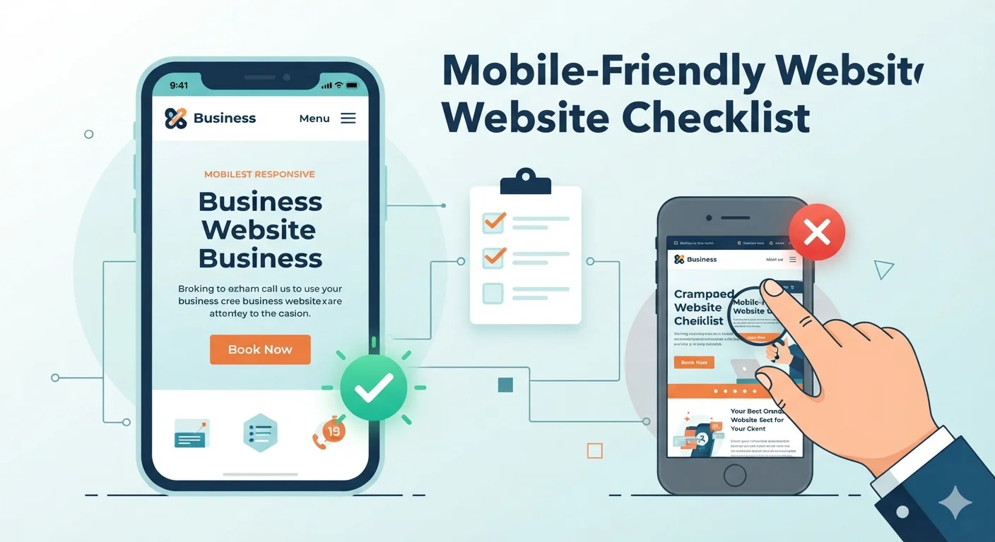
Your website may look good on a laptop.
But does it work well on a phone?
For many small businesses, mobile is the first real impression. People find your site from Google, social media, WhatsApp, maps, ads, or referrals, and they often open it on a mobile device.
If the website is slow, hard to read, difficult to tap, or annoying to use, visitors leave before they contact you.
A mobile-friendly website is not just a smaller desktop site. It is a website designed to help mobile visitors understand, trust, and act quickly.
Use this checklist to audit and improve your mobile website.
Quick mobile-friendly website checklist
Your website should have:
- Responsive design
- Fast mobile loading
- Readable text
- Tap-friendly buttons
- Simple mobile navigation
- Clear above-the-fold message
- Mobile-friendly contact forms
- Click-to-call and easy contact options
- Optimized images and videos
- No intrusive popups
- Same important content on mobile and desktop
- Strong Core Web Vitals
- Secure HTTPS pages
- Tested forms and CTAs
- Mobile analytics and conversion tracking
If your website fails several of these, it may be losing leads.
Why mobile-friendly design matters
Mobile-friendly design affects user experience, trust, SEO, and conversions.
A visitor on mobile usually has less patience and less screen space. They want quick answers.
They may be asking:
- What does this business do?
- Can they help me?
- Are they trustworthy?
- Do they serve my area?
- How do I call or contact them?
- Can I get a quote?
Your mobile website should answer those questions quickly.
Mobile problems that hurt leads
Common issues include:
- Slow loading
- Tiny text
- Buttons too close together
- Long forms
- Confusing menus
- Images that push content too far down
- Popups covering the page
- Phone number not clickable
- Contact form not working
- Important content hidden on mobile
These issues create friction. Friction kills leads.
Related: Why Your Website Is Not Getting Leads
1. Use responsive design
Responsive design means your website uses the same URL and content, but the layout adapts to different screen sizes.
This is usually the best approach for small business websites because it is easier to maintain than separate desktop and mobile sites.
Responsive design checklist
- Layout adapts to mobile, tablet, and desktop
- Text does not overflow
- Images resize correctly
- Navigation works on small screens
- Forms fit the screen
- Buttons are easy to tap
- No horizontal scrolling
Why responsive design matters for SEO
Google recommends responsive web design because it is easier to implement and maintain. With mobile-first indexing, Google primarily uses the mobile version of your content for indexing and ranking.
That means your mobile site cannot be treated as a lighter or incomplete version of your desktop site.
2. Keep the same important content on mobile and desktop
Do not remove important content from mobile just to make the page shorter.
Your mobile version should include the same important content as desktop:
- Main text
- Headings
- Service details
- Images with alt text
- Videos
- Internal links
- Structured data if used
- Metadata
What can change on mobile?
The design can change.
For example, you can use:
- Accordions
- Tabs
- Shorter section spacing
- Stacked layouts
- Smaller image crops
- Mobile-specific CTA placement
But the important content should still be available.
Content checklist
- Mobile homepage has the same core message as desktop
- Service details are visible on mobile
- FAQ content is accessible
- Testimonials are visible
- Internal links are present
- Images have descriptive alt text
- Page titles and descriptions match intent
If important information disappears on mobile, SEO and conversions can suffer.
3. Make the above-the-fold section clear
Above the fold means what users see before scrolling.
On mobile, this area is small. Use it carefully.
Mobile hero section should include
- Clear headline
- Short supporting sentence
- Primary CTA
- Trust signal if possible
- Simple visual if helpful
Weak mobile hero
“Welcome to our website”
This wastes valuable space.
Strong mobile hero
“Websites for small businesses that need more leads”
This explains what the business offers and why it matters.
Mobile hero checklist
- Headline explains what you do
- Subheading adds clear value
- CTA is visible without too much scrolling
- Text is readable
- Visual does not push the message too far down
- Header does not take up too much space
Clear above-the-fold messaging helps visitors decide to stay.
4. Make text easy to read
Mobile visitors should never need to pinch and zoom.
Mobile text checklist
- Body text is large enough
- Paragraphs are short
- Headings are clear
- Line spacing is comfortable
- Text contrast is strong
- Long words do not break the layout
- Buttons and labels do not overflow
Writing for mobile
Use:
- Short paragraphs
- Clear headings
- Bullet points
- Simple language
- Scannable sections
Mobile users scan. Make the page easy to scan.
Common mistake
Many websites use desktop-style paragraphs on mobile.
A paragraph that looks normal on desktop may become a wall of text on a phone.
Break content into smaller chunks.
5. Use tap-friendly buttons
Buttons should be easy to tap with a thumb.
If buttons are too small or too close together, users may tap the wrong thing or give up.
Button checklist
- Buttons are large enough
- Buttons have enough spacing
- Primary CTA stands out
- Button labels are clear
- Buttons do not wrap awkwardly
- Buttons work on touch devices
- Header CTA is easy to tap
Good mobile CTA labels
Use clear action text:
- Get a free website audit
- Request a quote
- Call now
- Book a consultation
- Start your project
Avoid vague labels:
- Submit
- Click here
- Learn more
Related: Website Conversion Best Practices: Turn Visitors into Customers
6. Simplify mobile navigation
Mobile navigation should help visitors find key pages quickly.
Do not overload the menu.
Essential mobile navigation links
For most business websites, include:
- Home
- Services
- Portfolio or case studies
- Blog or resources
- About
- Contact
If you are a local business, also include:
- Call button
- Service area
- Appointment or quote CTA
Mobile navigation checklist
- Menu is easy to open
- Links are readable
- Services are easy to find
- Contact is visible
- CTA is included
- Menu does not cover important content awkwardly
- User can close the menu easily
Navigation tip
Your most important pages should be reachable within 1-2 taps.
If users need to hunt for your contact page, the layout is working against you.
7. Make contact easy on mobile
Mobile visitors often want fast contact.
Make it easy for them to call, message, email, or submit a form.
Mobile contact options
Include:
- Click-to-call phone number
- Short contact form
- Email link
- WhatsApp link if used
- Booking link if relevant
- Map or service area for local businesses
- Response time expectation
Contact CTA examples
- Call now
- Request a quote
- Book appointment
- Send project details
- Get a free consultation
Contact checklist
- Phone number is clickable
- Contact page is easy to find
- Form works on mobile
- Form fields are large enough
- CTA button is easy to tap
- Success message appears after submission
- User knows what happens next
Example reassurance:
We usually reply within 24 hours. No spam, no pressure.
This small line can reduce hesitation.
8. Shorten mobile forms
Long forms are painful on phones.
Ask only what you truly need to start the conversation.
Recommended mobile form fields
Use:
- Name
- Service needed
- Message
Optional:
- Phone number
- Website URL
- Budget range
But do not make everything required unless necessary.
Mobile form checklist
- Form has 3-5 main fields
- Labels are clear
- Fields are easy to tap
- Keyboard type matches input
- Required fields are obvious
- Error messages are clear
- Submit button is visible
- Form works after testing
Form mistake to avoid
Do not ask for 10+ fields before trust is built.
You can collect details after the lead starts the conversation.
9. Optimize mobile speed
Mobile speed is one of the biggest parts of mobile experience.
Even a beautiful website can fail if it loads slowly on a phone.
Common speed problems
- Large images
- Heavy videos
- Too many plugins
- Slow hosting
- Unused JavaScript
- Too many tracking scripts
- No caching
- Bloated themes
- Large fonts or design assets
Mobile speed checklist
- Images are compressed
- Images are correctly sized
- Lazy loading is used where appropriate
- Hosting is reliable
- Caching is enabled
- Unused scripts are removed
- Fonts are optimized
- Page is tested on mobile
Speed tip
Do not test only on fast office Wi-Fi.
Test on mobile data too. That is closer to how many real users experience your site.
Related: Top WordPress Plugins & Tools for Faster, More Secure Websites
10. Improve Core Web Vitals
Core Web Vitals measure important parts of page experience.
They focus on loading performance, responsiveness, and visual stability.
What to watch
Pay attention to:
- How quickly the main content loads
- How responsive the page feels
- Whether content shifts while loading
Core Web Vitals checklist
- Main content loads quickly
- Buttons respond quickly
- Layout does not jump around
- Images have width and height set
- Fonts do not cause major layout shift
- Ads or embeds do not push content unexpectedly
- Mobile report is checked separately from desktop
Where to check
Use:
- Google Search Console Core Web Vitals report
- PageSpeed Insights
- Lighthouse
- Chrome DevTools
Do not chase scores blindly. Use them to improve real user experience.
11. Optimize images and videos for mobile
Images and videos can make a website feel professional.
They can also make it slow and hard to use.
Image checklist
- Images are compressed
- Correct sizes are used
- Responsive images are used
- Important images have alt text
- Decorative images do not slow the page
- Images do not crop important details awkwardly
- File names are descriptive where possible
Video checklist
- Videos do not autoplay with sound
- Videos are easy to find
- Videos do not block important content
- Thumbnails are optimized
- Embedded videos do not slow the first load too much
- Captions are included where needed
Mobile image mistake
Do not use a huge desktop image and simply shrink it with CSS.
Serve appropriately sized images for mobile.
12. Avoid intrusive popups
Popups can work, but they can also ruin the mobile experience.
On small screens, intrusive popups can cover the content, block navigation, and annoy users.
Popup checklist
- Popup does not appear immediately
- Popup is easy to close
- Popup does not cover the whole screen unnecessarily
- Popup does not block the main content
- Popup is not repeated too often
- Important pages work without popup interaction
Better alternatives
Instead of aggressive popups, use:
- Inline CTA sections
- Sticky but small contact button
- Blog content upgrades
- Footer signup
- Exit-intent on desktop only
- Timed offers after user engagement
For mobile, less interruption usually works better.
13. Make local business details easy to find
If you are a local business, mobile visitors may be ready to call or visit.
Do not bury local information.
Local mobile checklist
- Business name is clear
- Service area is listed
- Phone number is clickable
- Address is visible if relevant
- Hours are included
- Google Maps link is available
- Reviews are visible
- Services are easy to find
- Emergency or same-day service is clear if offered
Local CTA examples
- Call now
- Get directions
- Book appointment
- Request local quote
- Check availability
Related: SEO for Local Businesses: Simple Steps to Rank and Get More Leads
14. Make service pages mobile-friendly
Service pages are often where visitors decide whether to contact you.
Do not make them thin or hard to read on mobile.
Mobile service page layout
Use this structure:
- Clear service headline
- Short summary
- CTA
- Problems you solve
- What is included
- Benefits
- Process
- Proof or testimonials
- FAQ
- Final CTA
Service page checklist
- Service is clear from the headline
- CTA appears near the top
- Sections are short and scannable
- Benefits are easy to understand
- FAQs are easy to expand/read
- Trust signals appear before final CTA
- Internal links are included
Related: Best Website Layouts for Service Businesses
15. Test on real devices
Responsive browser previews help, but they are not enough.
Test your site on real phones when possible.
Device testing checklist
Test:
- iPhone
- Android phone
- Small screen size
- Large screen size
- Tablet
- Different browsers
- Mobile data
- Wi-Fi
What to test
Check:
- Homepage
- Service pages
- Blog posts
- Contact page
- Forms
- CTA buttons
- Menus
- Images
- Footer links
- Checkout or booking if used
Monthly mobile test
Once a month, open your site on your phone and complete the main action:
- Submit the contact form
- Tap the phone number
- Click the CTA
- Open the menu
- Read a service page
Small issues can quietly cost leads.
Mobile-friendly website audit checklist
Use this full checklist to review your site.
Design and layout
- Responsive design works
- No horizontal scrolling
- Text is readable
- Buttons are tap-friendly
- Layout does not feel crowded
- Header does not take too much space
Content
- Important desktop content exists on mobile
- Headings are clear
- Paragraphs are short
- Services are explained
- FAQs are accessible
- Internal links are included
Speed
- Images are compressed
- Videos are optimized
- Caching is enabled
- Unused scripts are removed
- Core Web Vitals are monitored
Conversion
- CTA appears above the fold
- CTA appears throughout the page
- Contact form is short
- Phone number is clickable
- Success message works
- Trust signals appear near CTAs
SEO
- Mobile content matches desktop intent
- Titles and descriptions are present
- Headings are meaningful
- Images have alt text
- Structured data is present if used
- Google can access page resources
Trust and security
- HTTPS is active
- Privacy policy is linked
- Reviews/testimonials are visible
- Contact details are real
- No intrusive popups block content
Tracking
- Google Analytics is installed
- Search Console is connected
- Form submissions are tracked
- Phone clicks are tracked
- Mobile performance is reviewed
Common mobile website mistakes
Mistake 1: Designing only on desktop
Many websites are approved on desktop, then mobile becomes an afterthought.
For business websites, mobile should be reviewed from the start.
Mistake 2: Hiding important content on mobile
Do not remove service details, FAQs, testimonials, or internal links just to shorten the page.
Use better layout, not less useful content.
Mistake 3: Using long forms
Mobile forms should be short and easy.
Mistake 4: Letting popups block the page
Intrusive popups can hurt user experience and reduce trust.
Mistake 5: Making CTAs hard to tap
Your CTA should be visible, readable, and easy to tap.
Mistake 6: Forgetting to test after updates
New plugins, images, forms, or scripts can break mobile pages.
Test after every major update.
Frequently asked questions
What makes a website mobile-friendly?
A mobile-friendly website adapts to small screens, loads quickly, uses readable text, has tap-friendly buttons, keeps navigation simple, makes contact easy, and provides the same important content users need on desktop and mobile.
Is responsive design good for SEO?
Yes. Google recommends responsive web design because it is easier to implement and maintain. It uses the same URL and HTML while adapting layout to different screen sizes.
Why does mobile-first indexing matter?
Mobile-first indexing means Google primarily uses the mobile version of your content for indexing and ranking. If your mobile site has less useful content than desktop, search performance can suffer.
How do I check if my website is mobile-friendly?
Test it on real phones, use Lighthouse or PageSpeed Insights, check Google Search Console, and manually review important pages like homepage, service pages, blog posts, and contact forms.
What is the most important mobile website feature?
The most important feature is clarity. Visitors should quickly understand what you do and how to take the next step.
After that, focus on speed, readable text, simple navigation, and easy contact.
Should I use a sticky mobile CTA?
A sticky CTA can help if it is small, useful, and does not cover content. Good sticky CTAs include “Call,” “Book,” “Quote,” or “WhatsApp.”
Avoid large sticky bars that make the page hard to read.
How often should I test my mobile website?
Test your mobile website after every major update and at least once per month. Always test forms, CTAs, menus, and phone links.
Can a slow mobile website reduce leads?
Yes. Slow loading creates friction and can make visitors leave before reading your offer or submitting a form.
Final recommendation
A mobile-friendly website should be fast, clear, easy to use, and easy to contact from a phone.
Start with the basics:
- Use responsive design
- Keep important content on mobile
- Make the hero section clear
- Use readable text
- Make buttons easy to tap
- Simplify navigation
- Shorten forms
- Optimize speed
- Avoid intrusive popups
- Test on real devices
Mobile visitors are often ready to act. Your website should make that action effortless.
Need help checking your mobile website? Contact TheWebPal for a free mobile-friendly website audit, speed review, or redesign recommendation.